What are you looking for?
Most searched
Others were looking for...
Popular services
Our most popular services and solutions

In this case study called ‘Through the eyes of the fire department’, you will learn about our digital solutions for the various communication challenges faced by the Dutch Fire Department. From one overarching idea, we developed a brand story, platform, house style, and videos to make the Dutch Fire Department more visible than ever.
Many citizens know the fire department as the people that fight fires. Or else, as the people to call when a cat is stuck up a tree. But many are unaware that the fire department does much more than that. Each year, hundreds of lives depend on this high-pressure and very important job. It was up to Cooler Media to help the Dutch Fire Department with its image and positioning and to translate this to a digital platform.
Goal: Change its image and showcase employee recruitment and the diversity of the department. Show how complex some situations can be and communicate that the fire department involves many different aspects — more and different aspects than you might think at first.
Target group: Everyone living in the Netherlands.
Our role: Brand identity, brand story, content creation.
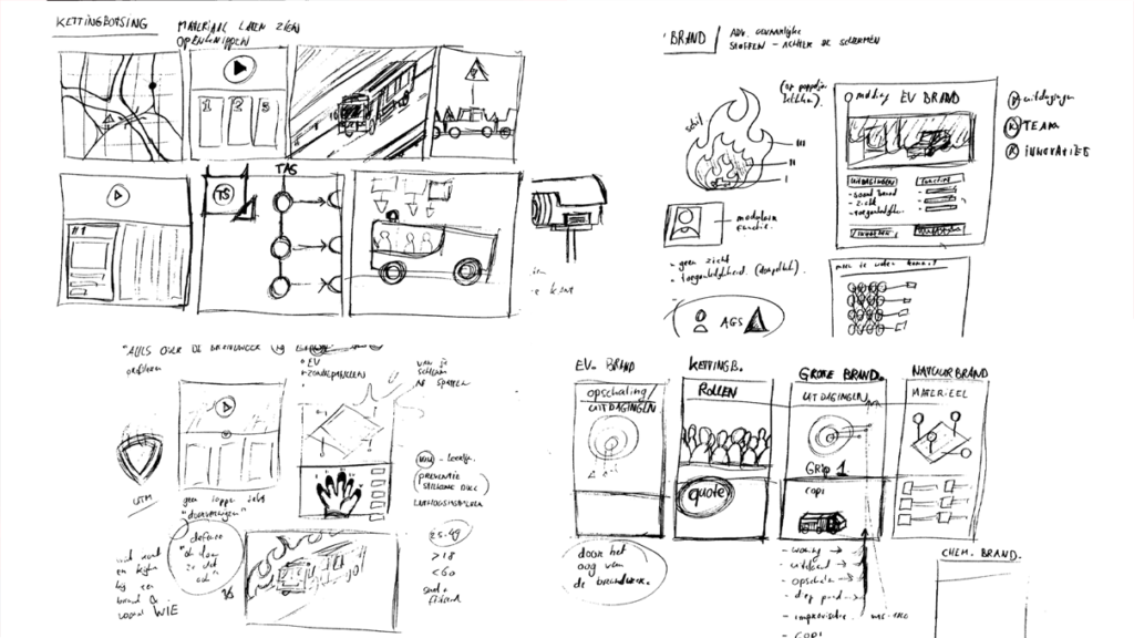
During our initial discussions, we used our familiar Magic Meeting technique to bring the true story to the fore. We achieved this through a combination of copywriting and visual design (mind mapping). After various interviews with stakeholders, we began with a mood board that brought together the ideas from all the different departments and which visualized the brand story. This enabled us to develop the “Through the eyes of the fire department” storyline, which became the umbrella under which this campaign and platform could be further developed.
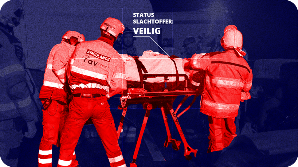
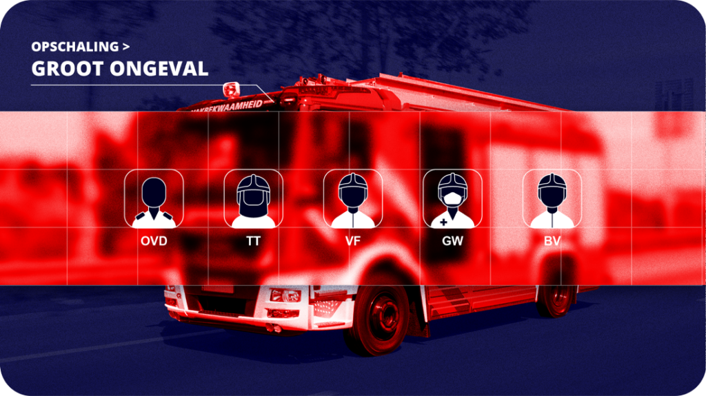
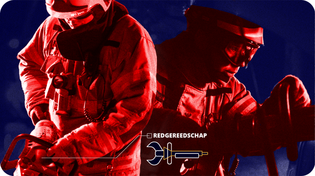
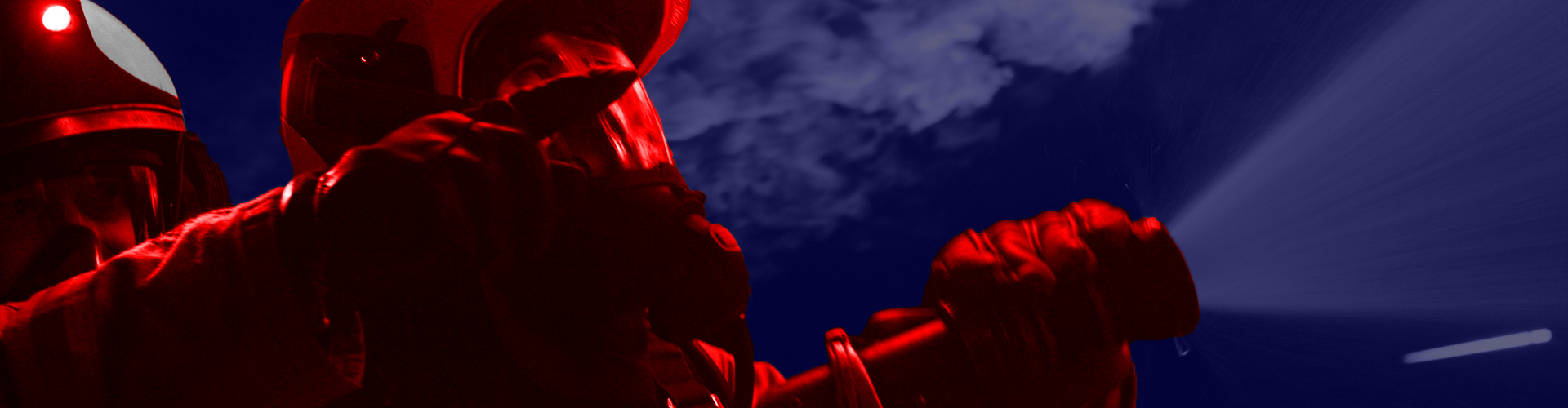
We then worked out the visual style in various rounds of feedback. Blue and red were chosen so that the visuals wouldn’t be too dark.
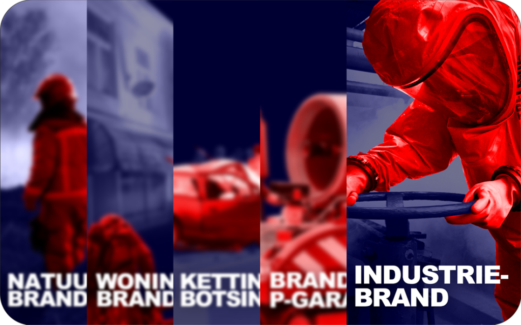
The final style was born out of lots of brainstorming sessions and an evaluation of the style choices. We laid a blue filter over the background and used a red filter for the live-action images of objects and people. That’s how we emphasized the central idea of the story behind each visual, which enabled the objects and people to really stand out.
The website is the central place where you can find all information and where all communication about the concept leads. The goal of the website is to inspire people to learn more about the fire department.
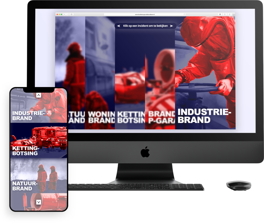
The most important aspect of the home page is to give visitors a clear overview of various incidents. This makes it easy for them to navigate the website from the home page. The ability to add additional incidents has been taken into account.
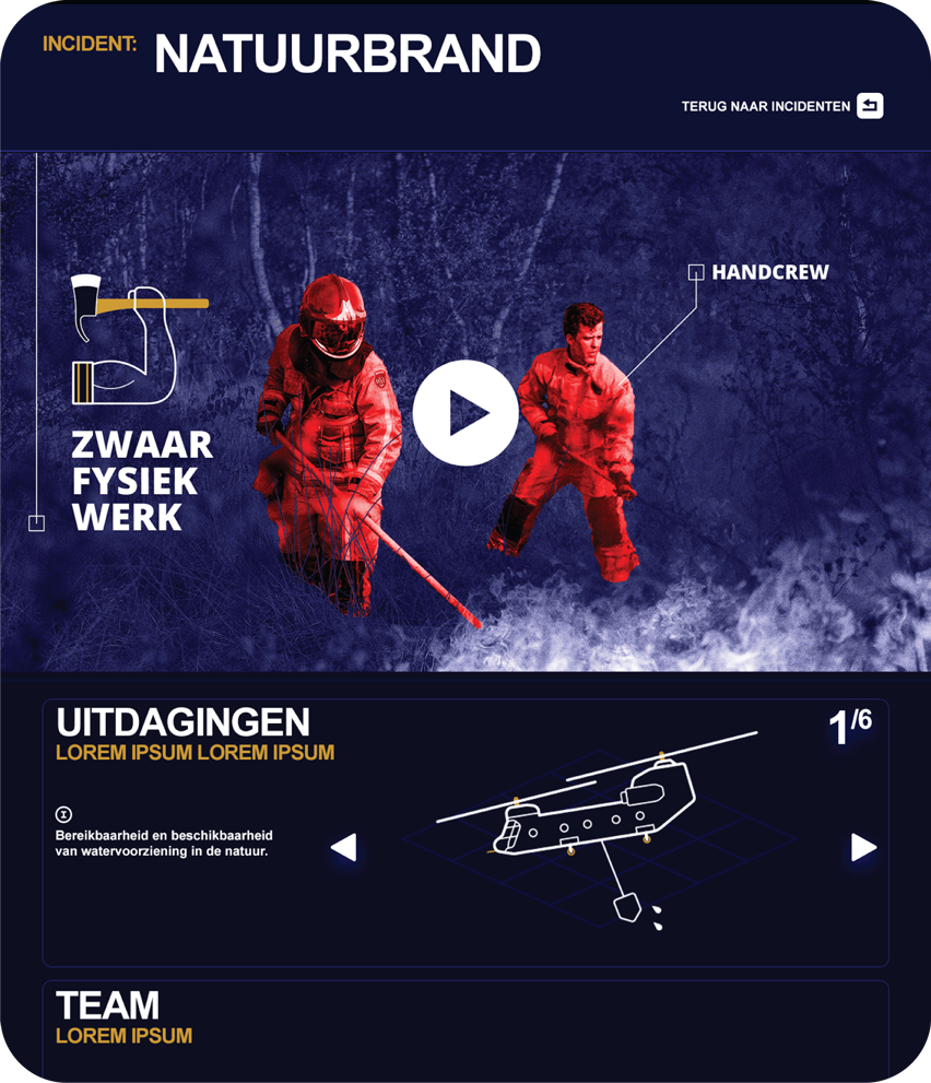
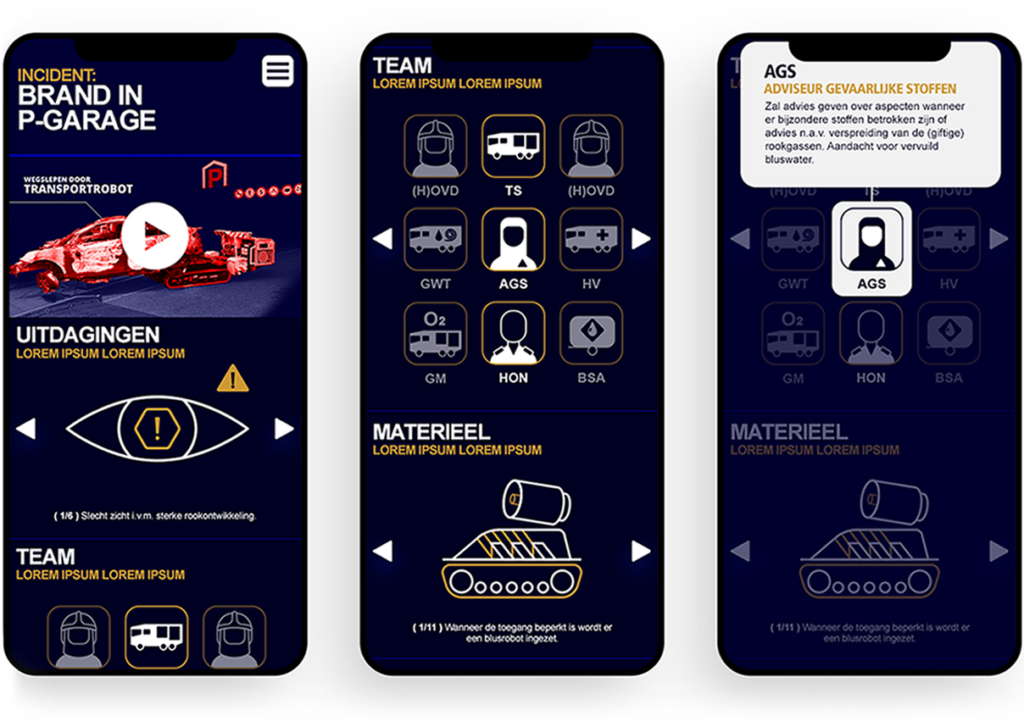
An animated video is a central element of an incident page. This video tells the visitor about an incident. Examples include wildfires, apartment fires, multiple vehicle collisions, garage fires, and industrial fires. More information can be found underneath the video, which is divided into 5 segments. These segments are the challenges faced by the fire department, the team that is called in (including experts), the material deployed, a quotation from the work area and, finally, a FAQ.
A mobile version of the platform has also been developed. This version is a one-to-one match with the desktop version but one that, of course, has been optimized for mobile users. This means that the icons are arranged differently, and everything is on one page.
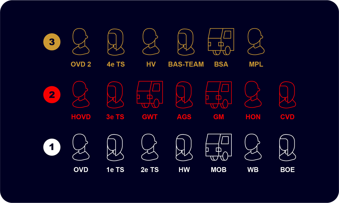
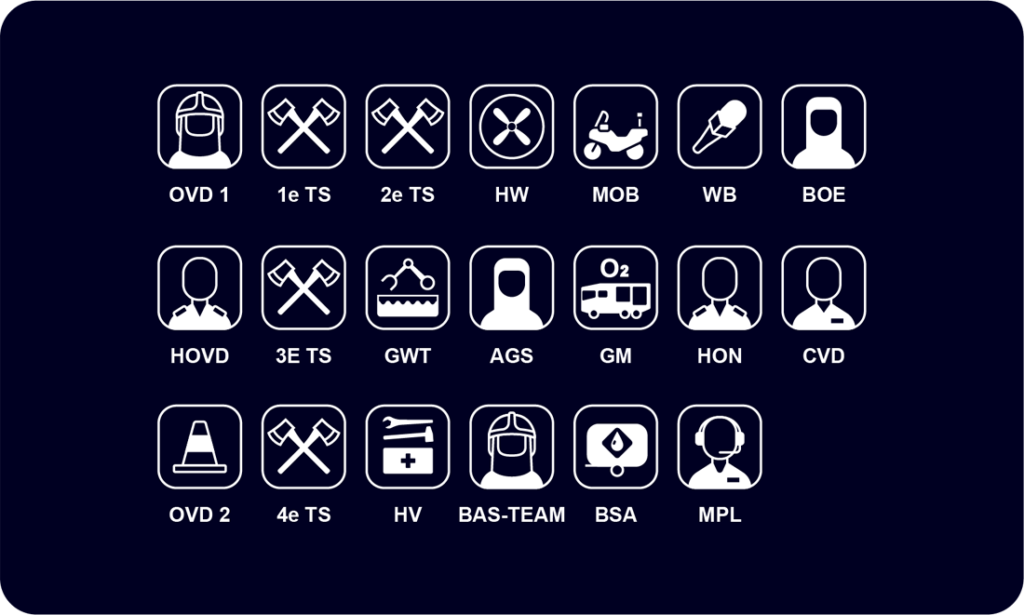
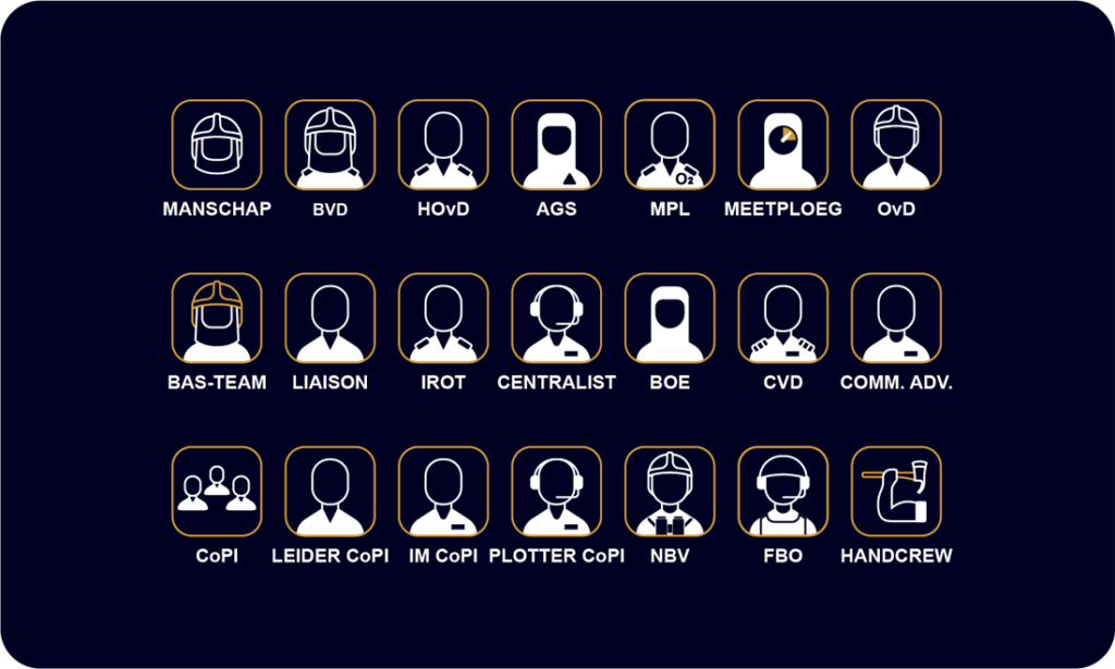
We developed over 100 icons to illustrate the fire department’s versatility and the various roles firefighters perform. Attention was given to the readability and visibility of the shapes of the icons. Over the course of three rounds of adjustments, we have designed the perfect icons.
The icon for physically intensive work.
The icon for the Chinook Defense helicopter.
The icon for an off-road firefighting truck.
One of the material icons: a chainsaw.
“Designing a platform that could speak to such a broad target group was a challenge. In terms of design and animation, you want to go all-in and over the top without standing in the way of accessibility, clarity, and tranquility. I think we should be really proud of the results.”
Lars Weijers
Accountmanager

Helen Berger
Creative producer
Daniël Visscher
Art Director
Our experts are here to help. Leave us a message!